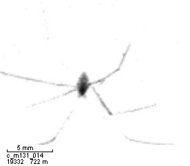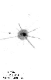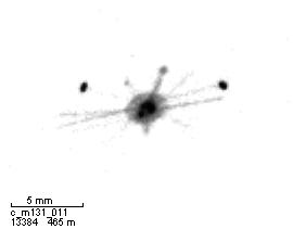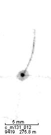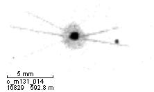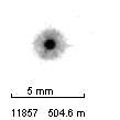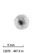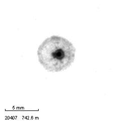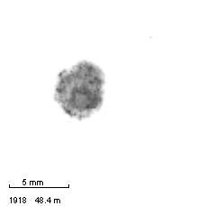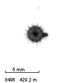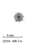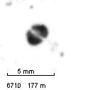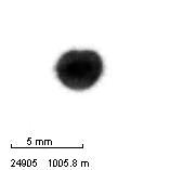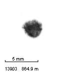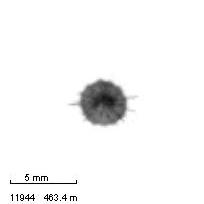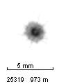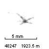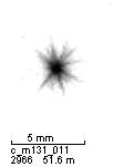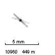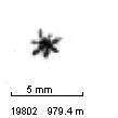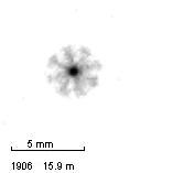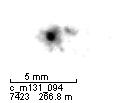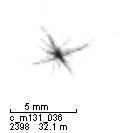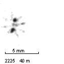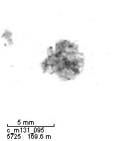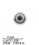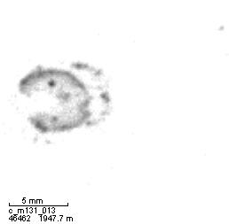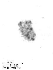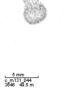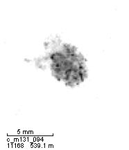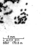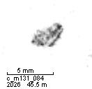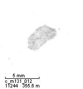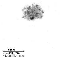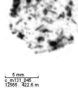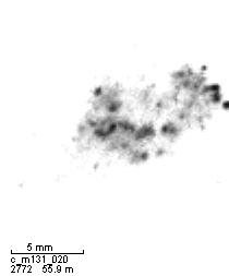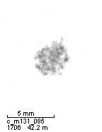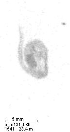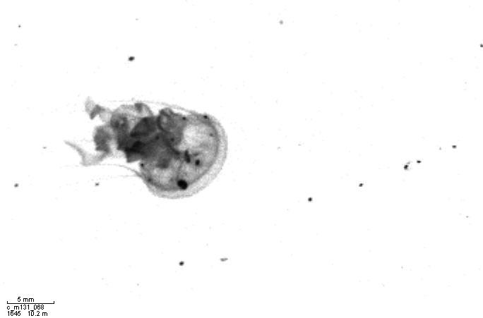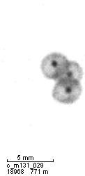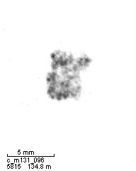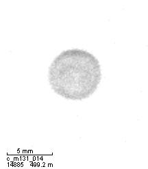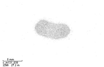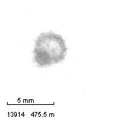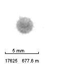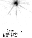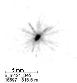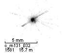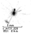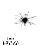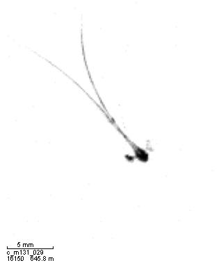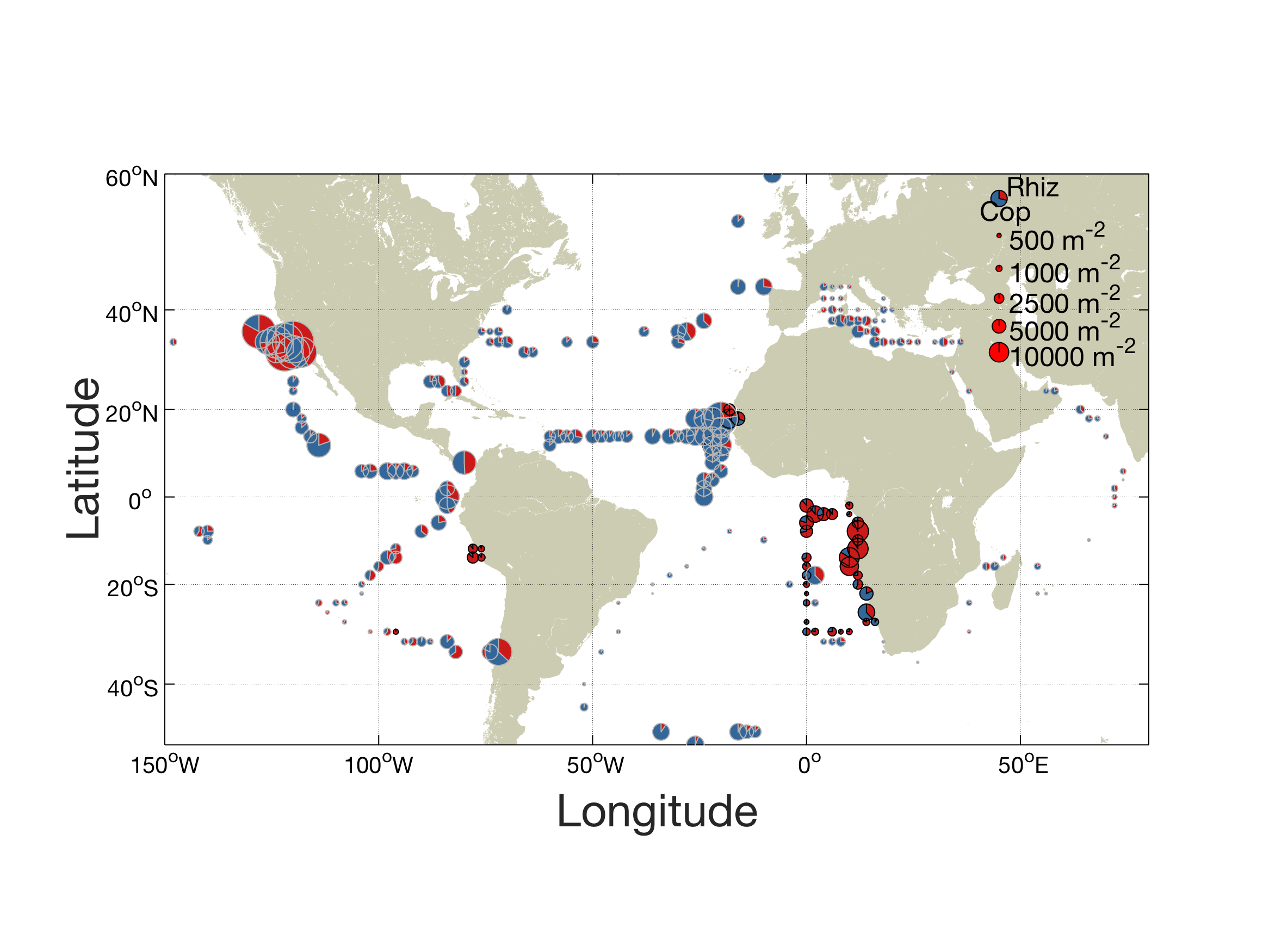
Global Rhizaria distribution: Here you can see the contribution of Rhizaria to the zooplankton in relation to Copepods in all regions that have been sampled by the UVP. The circles with the grey border indicate the results by Biard et al., those with the black border represent the PlanktonID results. The size of the circles indicates the standing stock of Rhizaria and Copepods at the respective position.
The first PlanktonID datasets are analyzed and here we present preliminary figures on Rhizaria distribution patterns and explain your contribution to this evaluation process.
The map on the left shows the proportion of Rhizaria in comparison to other zooplankton (mostly copepods) from all available UVP profiles. Although not all PlanktonID data could be integrated yet, you can already see that not only off California, but also in the upwelling areas off Peru, Mauritania and especially Namibia and Angola, the relative abundances of Rhizaria are elevated.
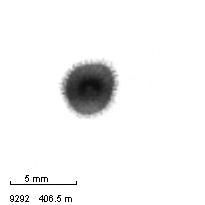
Further down you can see more figures on the distribution of individual categories in relation to oxygen concentration and depth off Peru. You can see that for example the sphere eye also occur at extremely low oxygen levels while copepods seem to rather avoid this oxygen minimum zone.
Last but not least we present parts of our evaluation of your image identifications. In the figures you can see that in some categories, for example the copepods, we can assign more than one third of the images that were classified as copepods into this category without further corrections. This facilitates our work and work flow a lot and saves us a lot of time!
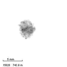
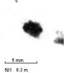
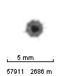
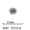
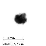
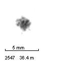
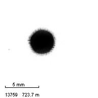
These figures show the distribution of different categories (depicted by the grey circles) in the upwelling area off Peru according to depth and longitude. The colours indicate the oxygen concentration and the size of the circles indicate the abundance of the category in that depth and longitude. You can see that the Sphere eye occur in extremely low oxygen concentrations, but favour deep water layers below 500 m depth. Copepods on the other hand seem to avoid the oxygen minimum zone. A very interesting pattern can be seen in the shrimp like - they are highly abundant in anoxic waters. However, maybe you remember that on many of these images, only the tails of the shrimps were left. This is not considered in this graphic, but will be investigated!
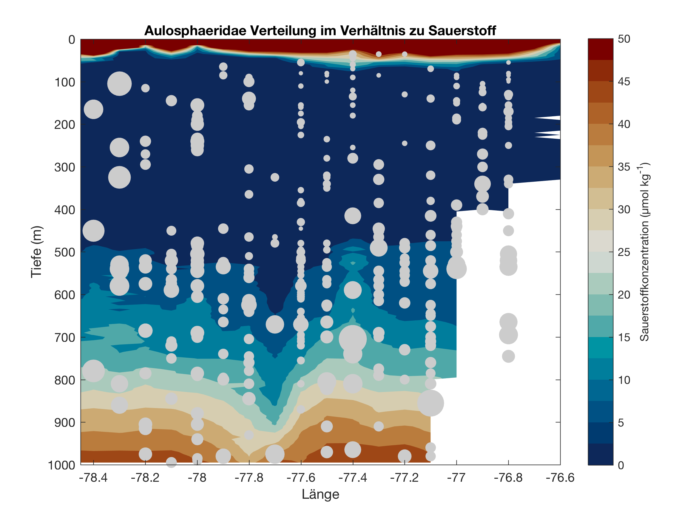
Sphere eye
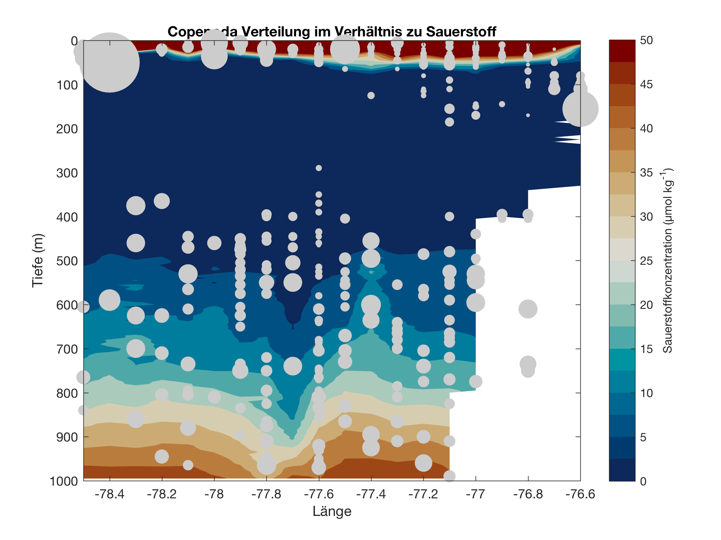
Copepoda
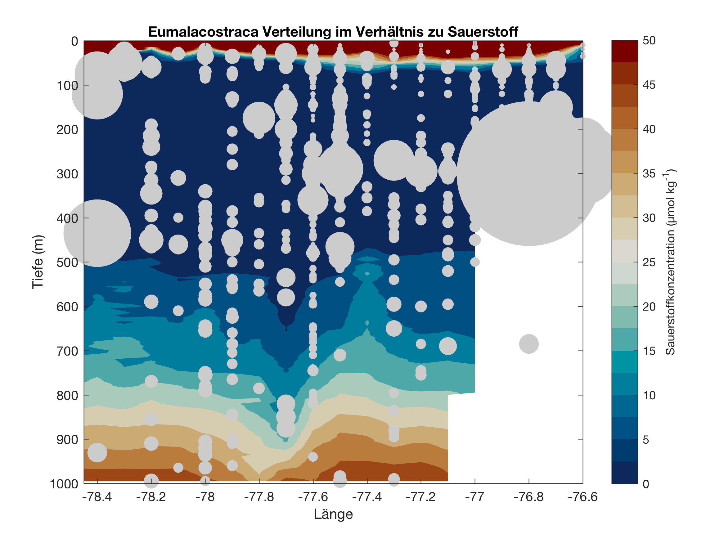
Shrimp like
Here you can see how we use the results generated by you in our game. From the 10 validations that we get we calculate a score for each image. A high score means that many players found that the image was correctly assigned to the respective category. In the upper part of the figures you can see how many images (vignettes) were in the dataset of the respective category and which scores were received. In the lower part you see the result of our verification of this classification. A high percentage of a score indicates that we found only a few erroneous validations within images that were assigned this score. Specifically this means that we can assume images of the category Sphereeye and Copepoda that received a score > 0.9 by you to be validated in this category with an error of less than 5%. Polychaeta on the other hand are a very difficult category and often have been wrongly assigned.
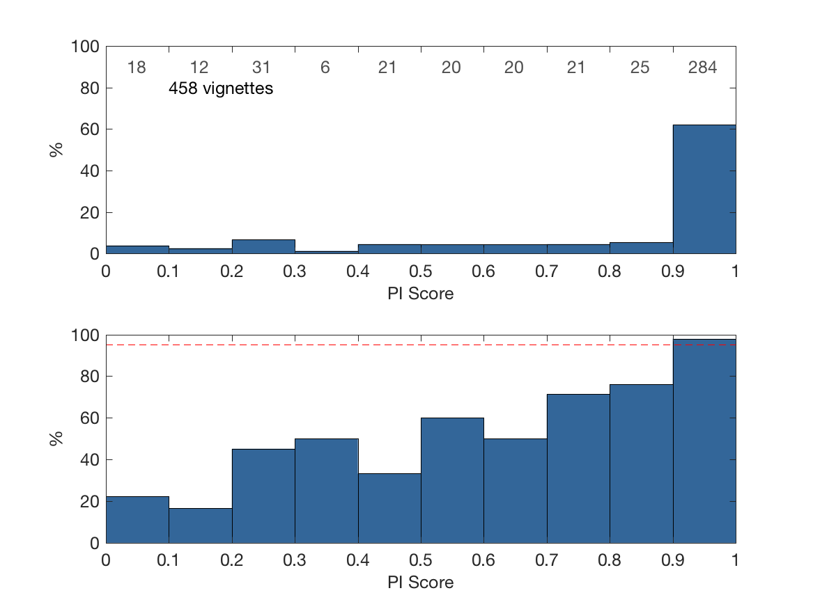
Sphere eye
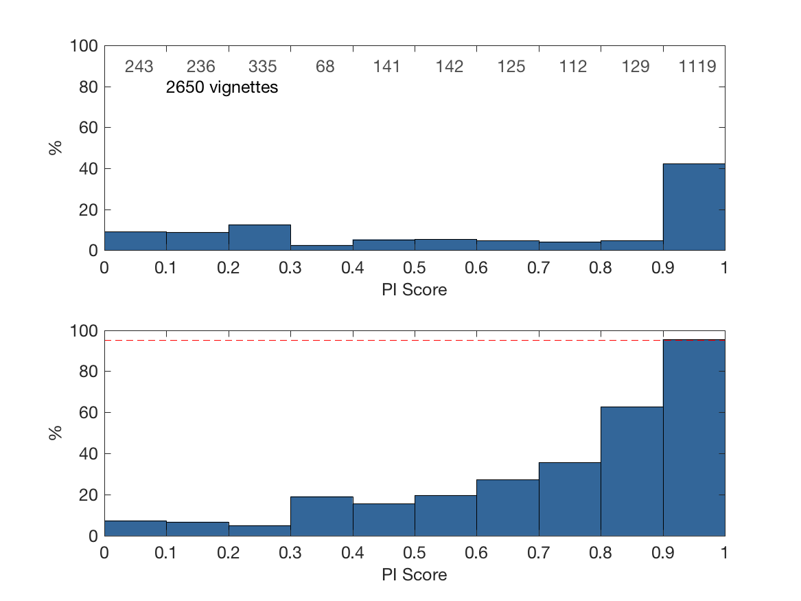
Copepoda
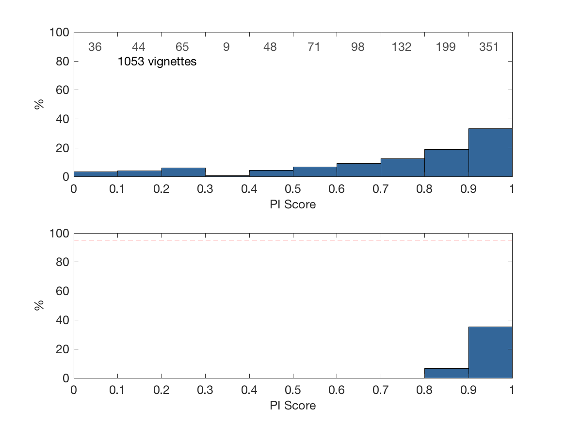
Zoo polychaeta
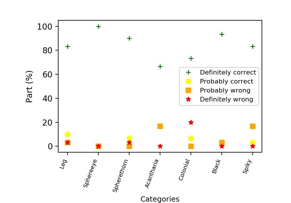
Consistency with our classification: Here you can see, in which percentage you sorted the images of the different categories as we would have done. In some cases, the category of the images was not clearly identifiable, thats why these images are marked as probably correct/wrong.
Here we present the first results of our evaluation.
We determined the consistency of your classification with ours and calculated how many images you collectively classified correctly. You are fantastic, we agree with your assignments in nearly all cases! This implies that our strategy works.
You can have a look at this excerpt of 30 images per category below. The bar on the right hand side of each image stands for the percentage of validation rounds that reached more than 85% as we only use these data in our evaluation. The larger the dark part of the bar, the better you played.
The images marked with a green frame are those for which the majority said it was correct in the respective category, i.e. you confirmed the automatic sorting. No frame means that you had a different opinion than the computer.
We will come up with more results soon, including more data and first analyses of distributions.


